

All Global Research articles can be read in 51 languages by activating the Translate Website button below the author’s name.
To receive Global Research’s Daily Newsletter (selected articles), click here.
Click the share button above to email/forward this article to your friends and colleagues. Follow us on Instagram and Twitter and subscribe to our Telegram Channel. Feel free to repost and share widely Global Research articles.
***
Cold and snow records have been set worldwide both this winter season and during the spring. All continents have experienced cold and precipitation that significantly deviate from the so-called climate normal, which is the average of the same measurement data over three decades. New Times has reported on this repeatedly. We also recently examined in detail temperature, snow, and ice data for the months of April and May from around the world and found several very interesting deviations. Among other things, this winter season’s snow mass and its bound water quantity in the northern hemisphere were far above normal.

Cold April i Luxemburg. The small country had one of the coldest and most rainy Aprils for ages. The average temperature was chilling 8 degrees Celsius through out the month. This is 1.6 degrees lowest than the average for the period 1991-2020. NOAA’s “creative” global temperature map for April, which system media presents to the public, states that the Benelux countries are “warmer than average”. Photo: RTL Luxembourg
According to Canadian climate authority Environment and Climate Change Canada (ECCC), their own statistics showed that the amount of water tied up in the northern hemisphere’s snow mass at the end of April this year amounted to about 2,600 cubic kilometers of water, compared with the norm of about 1,600 cubic kilometers. This means that this winter was over 60 percent more snow-rich than the norm for the years 1998–2011 (see “Record Cold and Snowy Spring Worldwide – Cold-hardened Mongolians Seek Help” in Nya Tider). This was very evident, among other things, in the snow cover rate in the USA. In at least 13 American states, several of which are located in the southern USA, the snow covered twice to 4.5 times as large areas as normal. This has led to state budgets for snow clearing being inadequate. Weather stations several meters high had to be dug out by shocked meteorologists in the state of Utah (see “Spring has begun with record cold – USA buried under gigantic snow masses” in Nya Tider). In California, the situation was so extreme that houses were completely buried under snow after a total of more than 20 meters of snowfall during the winter. The houses only began to emerge from the snow masses in May, with milder temperatures and melting. The California authorities have not even managed to clear all highways, as those at higher altitudes continue to be under about three meters of hard-packed snow, even though we are now entering the summer. For example, Route 120 is not expected to be cleared of snow and passable until July (see “Snow chaos in the USA: California’s roads remain impassable” in Nya Tider).
Unusually Cold April
New Times found when examining temperature data from authorities and research organizations from a number of different countries that April was unusually cold in many parts of the world. Numerous cold records were set in April. In North America and the continental USA, several cold records were also set since measurements began. Alaska saw one of the coldest April months since measurements began nearly a hundred years ago.
Europe looked similar with unusual cold and precipitation primarily in Central and Eastern Europe. Cold and spring snow caused the Alps’ glaciers to grow, and ski resorts that had closed for the season could reopen and continue skiing into the summer. We reported that the ice cover in the Arctic during the second half of April was about 20,000 square kilometers larger than the average for the years 2011 to 2020.
Central Asia and India set a multitude of cold records week after week in April, which continued even into May. In India’s case, the Indian Institute of Tropical Meteorology (IITM) confirmed that this was a trend over time and not an anomaly this spring.
The southern hemisphere also experienced a cold April, which is an autumn month there. In Australia and many other countries, temperatures were below the 30-year so-called climate normal.
Deceptive Maps
In May, the American governmental science organization National Oceanic and Atmospheric Administration (NOAA) released a world map showing temperatures for April… or rather, two global temperature maps – one for researchers and one for the general public. The first map shows land and sea temperature deviations from the average in April, where the average is calculated based on the 30-year climate norm, which in this case are the years 1991–2020. It is color-graded on a scale with 0.5-degree accuracy, showing colder deviations in blue shades, neutral in white, and warmer deviations in red shades. This is the map that climate researchers themselves use.
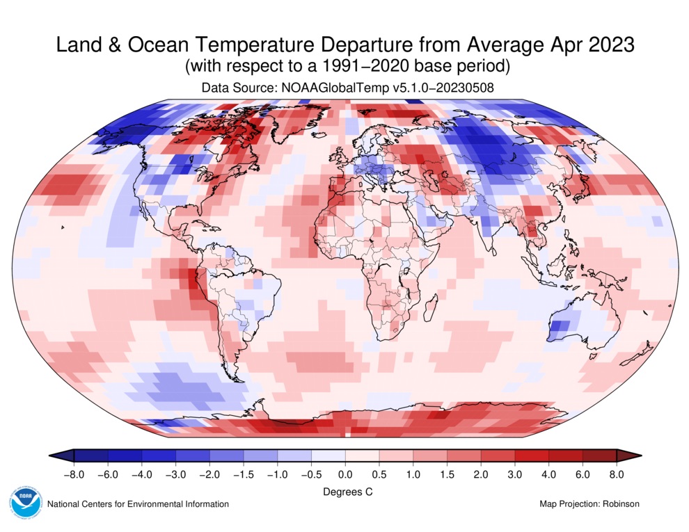
TEMPERATURE DEVIATIONS FOR LAND AND SEA, APRIL 2023 relative to the temperature normal, the average for the years 1991–2020. In this map, which uses a clearly indicated and color-coded temperature scale that the scientists themselves use, the temperature deviations we reported about over the last few months from North and South America, Central and Eastern Europe, and Central Asia, with hard-hit Mongolia, India, and Australia, are confirmed. This is despite the fact that critics argue it consistently shows higher temperatures due to non-representative and then tampered with measurement data. Source and map: NOAA
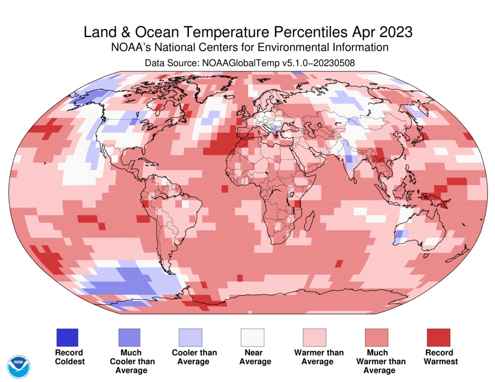
TEMPERATURE PERCENTILES FOR LAND AND SEA, APRIL 2023 based on an unspecified average. Here we can see that the Benelux countries, where Belgium and the Netherlands in April were 1.4 and 1.1 °C cooler than the climate normal 1991–2020, are falsely presented as having had an April average temperature “Above average” or “Much above average”. Central and Eastern Europe, which were much cooler than normal in April—for example, Czech Republic, Slovakia, and Serbia were 2.1 to 2.8 °C below the climate normal in April, which is significant in a climate context—are marked as “Near average” with misleading neutral white color. Source and map: NOAA
At the same time, NOAA published on its website National Centers for Environmental Information (NCEI) another map, and it’s this one that mainstream media reproduce for the public. It shows what’s called “Temperature percentiles for land and sea, April 2023.” So it’s not about deviations in degrees Celsius or percent, as the uninitiated might believe. We ask the politically correct tech giant Google what percentile means. We choose Google, as they are known for strictly controlling search results and ensuring compliance with the climate narrative as prescribed by the establishment and their media. The answer we get is as follows:
“In statistics, a percentile is a term that describes how a unit of value compares to other units of value from the same [data] set. Although there is no universal definition of percentile, it is usually expressed as the percentage of values in a set of data results that fall below a given value.”
We can conclude that such a vague description opens up for the creation of “creative statistics.” Percentiles are normally used in statistics to show distributions such as different age groups within a population, where it clearly shows how many percent each group constitutes. The problem with NOAA’s “media-adapted” map is that it does not state temperatures, percentages, or any real value. Instead, unspecified temperatures are compared to an average, which is also not clearly defined, unlike the “researcher version” of the map.
Unlike the temperature map provided to researchers, the temperature map that mainstream media presents to the public is almost entirely red. Moreover, the weaker blue shades are very grayish, creating the illusion that everything seems warmer and nothing cooler. All together, it creates a deceptive impression that April was warmer than normal even in parts of the world where we have official data that not only show the opposite, but in several cases, these are the lowest recorded temperatures ever. If you look at it without knowing that it is grossly misleading, it creates the false illusion that it confirms a purported global warming.
Garbage In, Garbage Out
What makes it even worse is that already the “researcher version” of the temperature map is misleading, as it too reports warmer temperatures than the real ones. This is achieved, among other things, by using measurement stations placed in aberrantly warm conditions and not least in cities, which create so-called heat islands. Cities are warmer than the countryside due to the so-called urban heat island effect. This is because the city’s often unnatural materials replace natural surfaces, and shading vegetation is replaced with dense concentrations of asphalt, buildings, and other surfaces that absorb and retain heat. If a large majority of all temperature measurement sites are located in cities, which can be several degrees warmer than surrounding less densely populated areas, the measured temperatures will also be several degrees higher than the actual ones.
New Times was the first Swedish newspaper to report in August 2022 that no less than 96 percent of NOAA’s American measurement stations in an old network have indicated too high temperatures. We could also show that NOAA and other American authorities were aware of this, but still used this misleading measurement data – despite a new network that delivers accurate measurement data being available (see “Misleading high temperatures from over 19 out of 20 weather stations in the USA – Measurement stations with correct data are deliberately ignored” in Nya Tider).
NOAA’s temperature map with percentiles – which mainstream media like to reproduce – is therefore grossly deceptive in a double sense. It shows countries and areas that were actually cooler or much cooler than normal in April, with temperatures “Near average” in white color, “Above average” in light red, or even “Much above average” in red.
What makes this temperature fraud so serious is that it is used to prove an alleged man-made global warming, a narrative that globalists then use to impose on the world’s governments and populations a total restructuring of society and our lives. These mandates have already seriously damaged energy and food security, eroding Western treasuries and private economies, and taking away a large part of our freedom and quality of life.
*
Note to readers: Please click the share button above. Follow us on Instagram and Twitter and subscribe to our Telegram Channel. Feel free to repost and share widely Global Research articles.
Featured image is from Means and Matters